In an increasingly digital world, a stellar performance in your CSS interview could be the difference between scoring that dream job or being rejected. But to perform well you need to know the most common CSS interview questions by heart! Enrolling in a CSS Training Course can provide you with the right guidance you need to perform well in your interview and make sure you know all the answers!
With 60% of tech recruiters highlighting CSS as a crucial skill set, brushing up on your knowledge has never been more important.
This comprehensive guide will take you through the most frequently asked CSS interview questions, leaving you well-prepared, confident, and ready to shine.
According to industry stats, candidates who spend focused time preparing for CSS interview questions are 78% more likely to succeed in their job interviews than those who don't.
Our video on "How to Properly Answer CSS Interview Questions" covers essential tips, including body language and effective communication strategies.
Learn how to confidently respond to common CSS interview questions and increase your chances of landing that dream job.
Let's dive in and get you to that top percentile!
Most Important CSS Interview Questions
This section delves deeper into the core questions likely to come up during a CSS interview.
How to Integrate CSS on a Web Page?
When it comes to integrating CSS on a webpage, there are three common methods you can employ:
- Inline Styling: This involves adding your CSS rules directly within the HTML tags using the style attribute. However, it's worth noting that this method can become quite messy for larger projects.
- Internal CSS: Here, you place all your CSS rules within the
What Are CSS Selectors?
One of the most fundamental aspects of CSS is understanding how to use selectors effectively. A CSS selector is part of a CSS rule set that selects the content you want to style. There are five main types of selectors:
- Element Selector: This targets HTML elements to style.
- ID Selector: This is unique within a page and is used to select a single element.
- Class Selector: This targets multiple elements that share the same class attribute.
- Universal Selector: This targets all elements on a page.
- Group Selector: This targets multiple selectors and applies the same styles.
Enrolling in an HTML Training Course provides students with the opportunity to delve into the fundamental aspects of CSS, including the effective use of selectors. Understanding the various types of selectors, such as the element, ID, class, universal, and group selectors, is essential for precise and targeted styling.
By mastering selector usage, students gain the skills to create visually appealing and well-structured web pages that make an impact.
What is the Difference Between Class and ID Selectors?
Let's tackle the difference between class and ID selectors in CSS - a question that frequently stumps even seasoned developers.
A class selector targets elements that share the same class attribute. You can use a class on multiple HTML elements, and multiple classes can be used on a single element. It's denoted by a period ('.').
An ID selector, on the other hand, is used to select one unique element. Each page can only use an ID once, and each element can only have one ID. It's represented by a hashtag ('#').
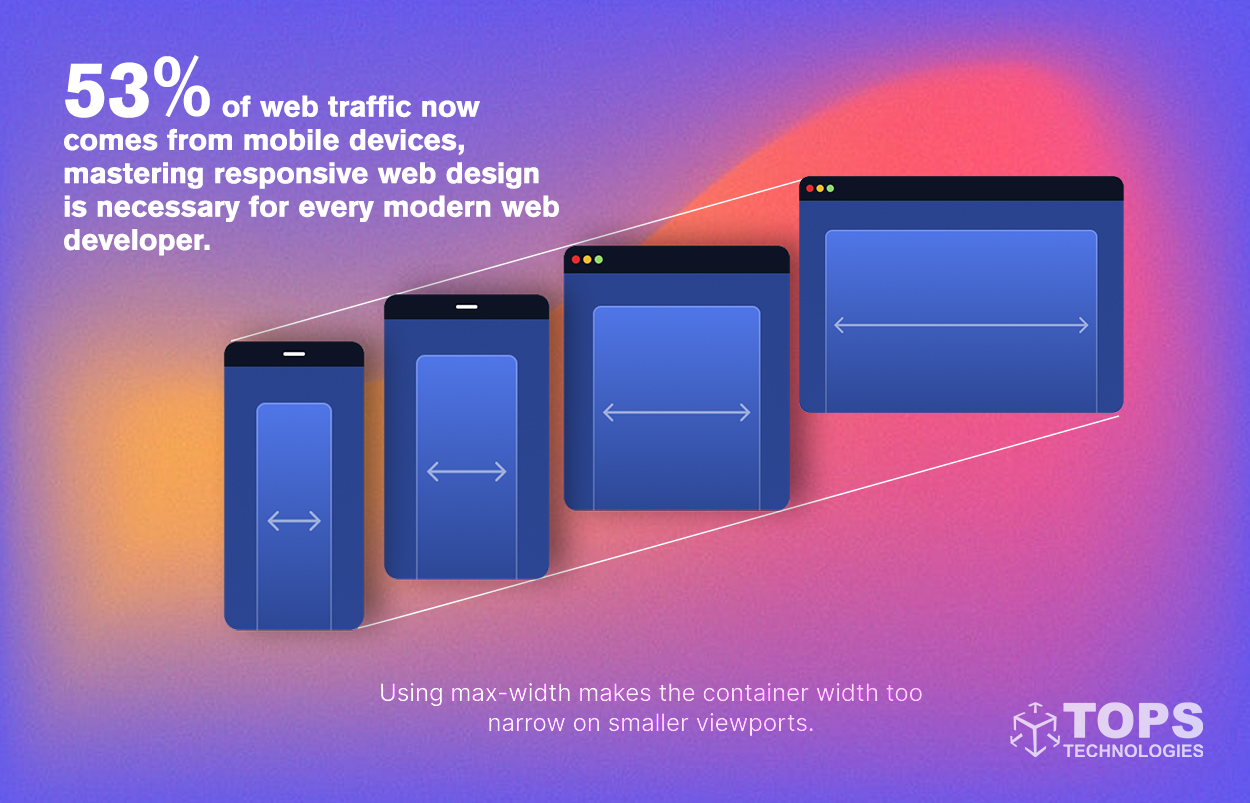
Can You Explain Responsive Web Design?
Responsive web design is about creating websites that provide an optimal viewing experience across various devices. It involves designing flexible websites that can automatically adjust the layout, images, and functionalities to fit different screen sizes.
As 53% of web traffic now comes from mobile devices, mastering responsive web design is necessary for every modern web developer.
What Are Pseudo Elements and Pseudo Classes in CSS?
Understanding pseudo-elements and pseudo-classes is a must for any CSS practitioner.
Pseudo-elements are keywords added to selectors that let you style a specific part of the selected element(s).
They include:
- ::before - inserts content before the content of the selected element
- ::after - inserts content after the content of the selected element
- ::first-letter - selects the first letter of each element
- ::first-line - selects the first line of each element
- ::selection - applies styles to the part of a document that the user has highlighted
Pseudo-classes, on the other hand, are used to define a special state of an element. Here are some commonly used pseudo-classes:
- :visited - selects all visited links
- :hover - selects elements when you mouse over them
- :active - selects the active link
- :focus - selects the input field currently in focus
These powerful tools in your CSS toolbox can make your designs much more dynamic and interactive.
What is the Difference Between visibility: hidden, display: none, and opacity:0?
This question pertains to how we can hide elements in CSS. While visibility: hidden, display: none and opacity:0 can all hide elements, they do so in different ways:
- visibility: hidden makes the element invisible, but the element still occupies space in the layout.
- display: none removes the element entirely from the document. It does not take up any space, even though the HTML for it is still in the source code.
- opacity: 0 makes the element invisible but still occupies space and interacts with the cursor.
What are the Position States in CSS?
CSS positioning is a complex topic, but at its core, there are five key position values:
- Static: This is the default value, and elements are positioned according to the normal flow of the page.
- Relative: This positions the element relative to its normal position.
- Fixed: This positions the element relative to the browser window.
- Absolute: This positions the element relative to its nearest positioned ancestor.
- Sticky: This is a hybrid type; it's relative until the viewport reaches a specified point and becomes fixed.
Understanding these states is critical for controlling the layout of your page.
Can You Define Z-Index in CSS?
The z-index in CSS is a property that determines the stack order of specific elements. An element with a higher z-index is always stacked in front of an element with a lower one.
It's particularly handy when dealing with overlapping elements and is crucial to mastering CSS positioning.
What is the Difference Between CSS Grid and Flexbox?
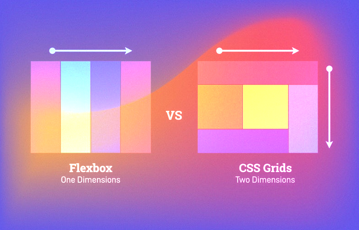
The decision between CSS Grid and Flexbox can sometimes feel tricky, but they each have their strengths.
CSS Grid is a two-dimensional system that handles columns and rows, making it excellent for designing complex web layouts. It was built to handle 2D layouts and gives you control over rows and columns.
Flexbox, or Flexible Box Module, is a one-dimensional layout model that deals with either columns or rows but not both simultaneously. Flexbox is perfect for distributing space along a single axis and excellent for application components or small-scale layouts.
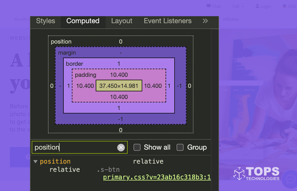
What is the CSS Box Model?
The CSS Box Model is a fundamental concept in CSS that describes the rectangular boxes generated for elements in the document tree and laid out according to the visual formatting model.
The box model encompasses margin, border, padding, and the actual content. All these have properties associated with them which can be manipulated to style the webpage. The total width and height of an element are determined by the box model.
How can CSS be used to create a CSS triangle?
CSS triangles can be created using the borders of an element. The core concept here is that a CSS triangle can be formed by manipulating the width and colour of the borders of a CSS element.
For instance, to create a triangle pointing upwards, you would set the bottom border to a certain width and colour and the rest of the borders to transparent and 0 width.
How does the CSS cascade work?
CSS stands for Cascading Style Sheets, and the 'cascading' part refers to the priority scheme to determine which style rule applies if more than one rule matches a particular element. This mechanism is known as the cascade.
It calculates the specificity of a selector to determine which rules to apply, with inline styles having the highest specificity and type selectors having the lowest. If two selectors apply to the same element, the one with higher specificity will take precedence. If they have the same specificity, the rule declared later will be applied.
What is the purpose of using @media in CSS?
@media rule, or Media Queries in CSS, is a technique introduced in CSS3 that allows developers to customize the layout of web pages for various devices or screen sizes.
They can be used to check many device features, such as width, height, resolution, etc. Media queries are a cornerstone technology of Responsive Web Design.
@media queries serve a dual purpose in CSS. They facilitate the creation of responsive layouts for different devices, but they also play a vital role in web design. By incorporating @media queries into their CSS code, students can learn to target specific breakpoints or device features to modify the design accordingly. Enroll in a Web Design Course to gain complete knowledge of how to use them.
Can you explain the CSS Flexbox layout?
Flexbox, or the Flexible Box Layout, is a layout mode in CSS3. It's designed to improve the items align, directions, order, and dimensions in a container, even when they are dynamic or even unknown.
The flex layout algorithm is direction-agnostic as opposed to the block, which is vertically based and inline, which is horizontally based. It provides for better control over align-items, justify-content, and direction of elements.
Whether it is a one-dimensional (Flexbox) or two-dimensional (Grid) layout, it can make the responsive design more efficient and easier to implement.
Get Interview Training Along With a 100% Placement Guarantee
TOPS Technologies, India's premier IT Training company, has been instrumental in shaping the careers of over 1 lakh students in its illustrious 15-year tenure. With a nationwide network of over 19 offices, an impressive tie-up with 3000+ companies, and a catalog of 50+ industry courses, TOPS is your one-stop solution for breaking into the IT industry.
Many students often struggle with interview anxiety, lack of practical knowledge, and underdeveloped technical skills, leading to rejection. Fortunately, TOPS Technologies has the remedy. Our CSS Training Course provides comprehensive training and hands-on experience to tackle these issues head-on.
We offer 100% job placement support, equipping you with the necessary skills and confidence to ace your interviews and secure your dream job. Start learning with TOPS today, and take the first step towards a successful career in IT.
Conclusion
Understanding CSS and its complex components is key in the tech industry, where 85% of jobs are filled via networking and personal development. Grasping these crucial CSS interview questions will give you an edge over other candidates and enhance your ability to create more efficient, attractive, and responsive web designs.
Remember, it's not just about memorizing these concepts; it's about understanding them well enough to apply them when right. Good luck with your preparation!