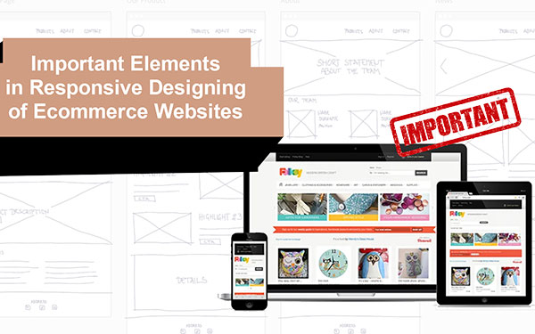
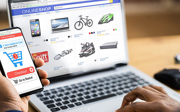
In today’s eCommerce business market it is extremely important for the sellers to have their business presence everywhere right from the web to the mobile and to the tablets for a seamless experience and to capitalize on a growing mobile presence. As a developer or a seller there are 2 different approaches to solve this issue: Either go and develop your eCommerce Native Application for all the devices or to go with a 1 size fit, all-in-one web based responsive design.

So we come to the main point of our blog:
What is Responsive Design and what do you need to take care while creating a responsive design? I wanted to write this blog majorly focusing on sellers who wanted to create a presence on web and mobile but I think the content of the blog is generic enough for even students to understand and follow the anatomy of a responsive design.
Main Aspects of Responsive Design
Every responsive website design has following three aspects which makes it flexible enough to fit to the viewing environment accordingly and hence, looks awesome without any disturbances or errors in design when opened through any platform.
Fluid Grids
A fluid grid is the concept of developing a flexible grid layout where website page elements sizing is automatically set to adjust according to relative units like percentages rather than pixels or points as in the normal designing process. Hence the web page fits any screen size automatically.
Flexible Images
The size of the images too is set according to the relative units so that they do not appear disturbed or out of their containing elements.
Media Queries
This is a responsive web designing technology in which a web page is automatically set to adapt a CSS style according to the browser width in the device in which the website is opened up.
Responsive website training course will teach you development of websites that can load faster and deliver enhanced user experience without any problems as in device-based solutions. There are five key elements to consider for responsive designing which can be learnt through web design course.
Masthead
Masthead is the top section of the website consisting of header, logo, primary navigation tools and search box. It is a good practice to go with a small header with simple linear CSS for greater flexibility in designing. The core content of the web page should be the main focus here.

However, larger and emphasized logo would help as this would be the identification of the business website.
Displaying the navigation menu or content is rather a difficult task on a small mobile screen. Hence one should go for alternatives. One can go for designing a simple menu anchor text which helps in main navigation on small screens or can also create a header anchor that leads the user to the menu in the footer. Left side navigation marked with an icon of menu that pushes the content of page to the right and slides into the page from the left would be a great idea to go with. However the simplest of all, would be the navigation in which the menu overlays the main content in the webpage.
Place a search box at the right or a custom position in the header as this would lead the users to what actually they are looking for.
Image Gallery
Better way to display products is through an image gallery. Displaying product images can be done in an effective way on small screens with the use of touch friendly image carousel which allows the user to swipe between the products with a slight touch. Make sure you use lightweight script to build this. This will reduce loading time and enhance the user experience.
Make sure to highlight the preview of various product views and link all the product images to their larger counterparts. This will enable the user to have a better view of product.
Product Description
A description guides user about the product and hence is an important requirement in website design. Making description containing price, name or rating of the product above its image will provide users with the necessary product information, while on the other hand the rating of the product displayed with stars and review count information provided along side of the product can be very helpful to the smart phone users who usually shop through their phones.
You can always have a share button placed near the information of products as this can be great way of promoting the products of the seller. Placing additional elements like quantity field, size dropdown and add to cart button can be of great help from user’s perspective.
Auxiliary Information
Once the logo, menus, products and their description are displayed, one can opt to showcase information like related products and product reviews which is important but not mandatory.
These elements can give a buyer idea of similar products and about the quality of products supplied by the organization or business.
Footer
Footer is the last but one of the most important sections of a website mandatory to display. This should include
Navigation links which is the best way of leading the user to main site navigation and other sections of the website for better user experience
The information including the customer service numbers and email id which can give the user contact information about the organization. You can also place a back link that directs the user to top navigation menu as this can also be a way of improving the user’s experience. Hence a better user experience is provided with a footer section, an important element for responsive web design.
Those looking to learn this technology should join a web design training institute for the best help. At TOPS Technologies, website designing institute one can learn the latest web design technologies along with the aspects and elements of responsive designing too. By enrolling into web designing course one can to achieve success in this field.

The top technologies course is designed to teach students about the latest and greatest technologies. It will cover web development, cyber security, programming languages, and more. If you want to be successful in the IT field, it's important that you have a good understanding of all the latest technologies. It training is perfect for anyone who needs to be ready for a career in the IT field. learn website design from our expert trainers and gain skills that are in high demand! The training course is perfect for anyone who needs to be ready for a career in the IT field. Learn android programming from our android training institute.
We provide the best web design course in Nagpur, Surat, Vadodara, Ahmedabad, Rajkot, and Nagpur with live projects and 100% placement assistance.
Author Bio:
Niral Modi works as a Chief Executive Officer at TOPS Technologies, which is an Education company with an estimated 303 employees; and was founded in 2008. They are part of the Executive team within the C-Suite Department, and their management level is C-Level. Niral is currently based in Chicago, United States.
TOPS Technologies offer the Best Web Design Course in Gandhinagar, Hardware Training Classes, Graphic Designing & Web Design Training through Live Project Training. Having tie-ups with 3000+ IT software development companies, We provide a 100% Job Guarantee in Software Development Courses. We are known for our training courses in PHP, Python, Java, Android & iOS, and Asp. Net, C & C++, Angular Courses, IoT, Software Testing, CCNA, Cloud Computing, Ethical Hacking, Hardware Networking, Cyber Security Training, Digital Marketing, MVC Training, and SEO. We also teach Laravel, Nodejs, Unity 3D Game Development, Machine Learning with Python, Data Science, and Linux server training. also, you can Check out our YouTube channel for more information on any course, such as Web Design training, graphic design, and web design, among others.


